Graphic design and statistical reporting principles
Source:vignettes/web_only/principles.Rmd
principles.RmdYou can cite this package/vignette as:
To cite package 'ggstatsplot' in publications use:

  Patil, I. (2021). Visualizations with statistical details: The
  'ggstatsplot' approach. Journal of Open Source Software, 6(61), 3167,
  doi:10.21105/joss.03167

A BibTeX entry for LaTeX users is

  @Article{,
    doi = {10.21105/joss.03167},
    url = {https://doi.org/10.21105/joss.03167},
    year = {2021},
    publisher = {{The Open Journal}},
    volume = {6},
    number = {61},
    pages = {3167},
    author = {Indrajeet Patil},
    title = {{Visualizations with statistical details: The {'ggstatsplot'} approach}},
    journal = {{Journal of Open Source Software}},
  }
This vignette is still work in progress.
Graphic design principles
Graphical perception
Graphical perception involves visual decoding of the encoded information in graphs. ggstatsplot incorporates the paradigm proposed in ((Cleveland, 1985), Chapter 4) to facilitate making visual judgments about quantitative information effortless and almost instantaneous. Based on experiments, Cleveland proposes that there are ten elementary graphical-perception tasks that we perform to visually decode quantitative information in graphs (organized from most to least accurate; (Cleveland, 1985), p.254)-
Position along a common scale
Position along identical, non-aligned scales
Length
Angle (Slope)
Area
Volume
Color hue
So the key principle of Cleveland’s paradigm for data display is-
“We should encode data on a graph so that the visual decoding involves [graphical-perception] tasks as high in the ordering as possible.”
For example, decoding the data point values in
ggbetweenstats requires position judgments along a common
scale:
ggbetweenstats(
  data = dplyr::filter(
    movies_long,
    genre %in% c("Action", "Action Comedy", "Action Drama", "Comedy")
  ),
  x = genre,
  y = rating,
  title = "IMDB rating by film genre",
  xlab = "Genre",
  ylab = "IMDB rating (average)"
)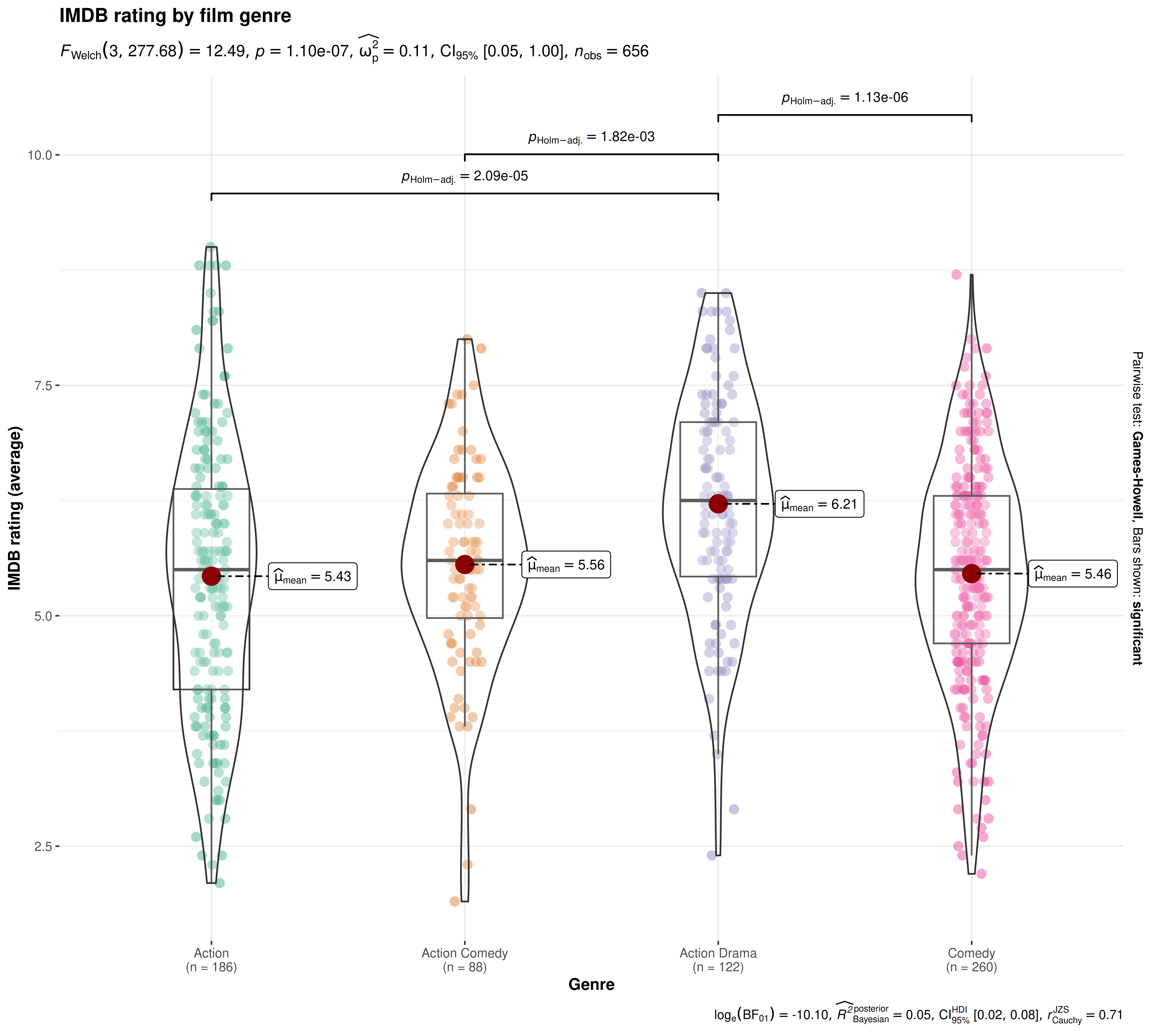
Note that assessing differences in mean values between groups has been made easier with the help of of data points along a common scale (the Y-axis) and labels.
There are few instances where ggstatsplot diverges from recommendations made in Cleveland’s paradigm:
- For the categorical/nominal data, ggstatsplot uses
pie charts which rely on angle judgments, which are less
accurate (as compared to bar graphs, e.g., which require
position judgments). This shortcoming is assuaged to some
degree by using plenty of labels that describe percentages for all
slices. This makes angle judgment unnecessary and pre-vacates any
concerns about inaccurate judgments about percentages. Additionally, it
also provides alternative function to
ggpiestatsfor working with categorical variables:ggbarstats.
ggpiestats(
  data = mtcars,
  x = am,
  y = vs
)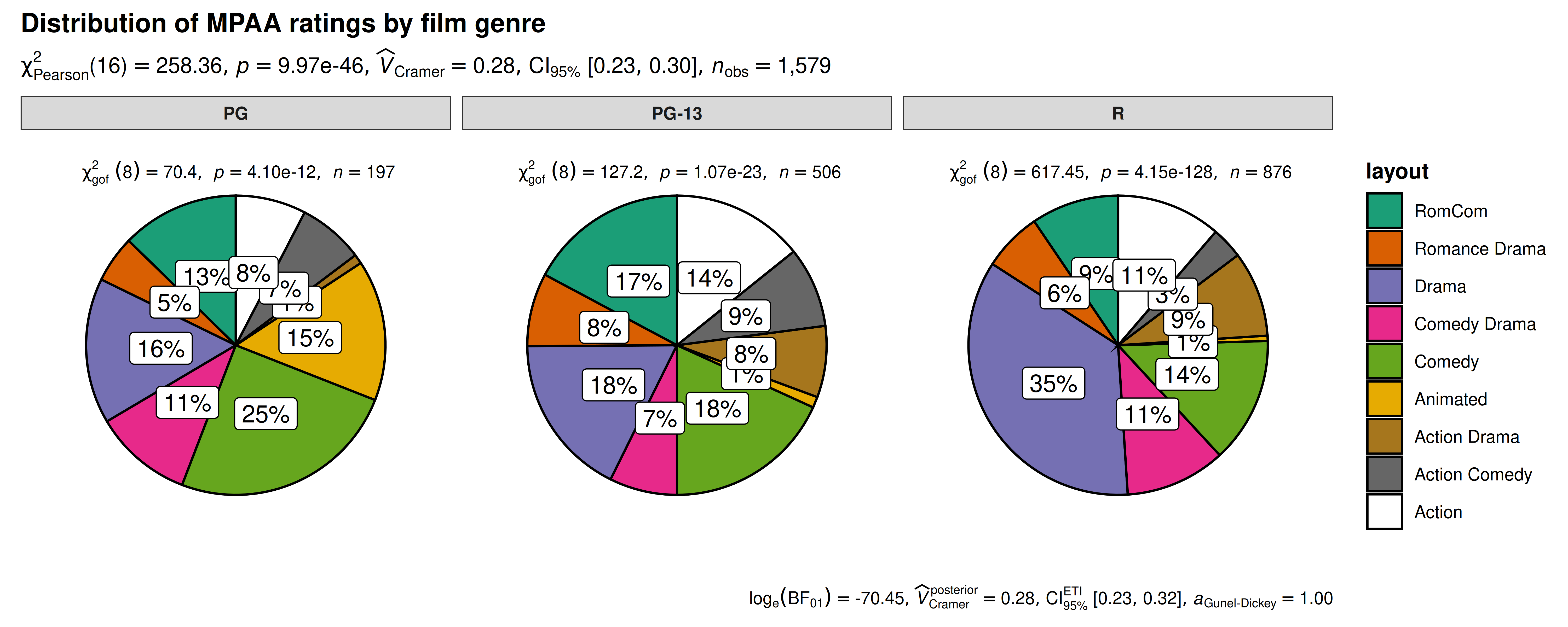
Pie charts don’t follow Cleveland’s paradigm to data display because they rely on less accurate angle judgments. ggstatsplot sidesteps this issue by always labelling percentages for pie slices, which makes angle judgments unnecessary.
- Cleveland’s paradigm also emphasizes that superposition of
data is better than juxtaposition ((Cleveland, 1985), p.201) because this allows
for a more incisive comparison of the values from different parts of the
dataset. This recommendation is violated in all
grouped_variants of the function. Note that the range for Y-axes are no longer the same across juxtaposed subplots and so visually comparing the data becomes difficult. On the other hand, in the superposed plot, all data have the same range and coloring different parts makes the visual discrimination of different components of the data, and their comparison, easier. But the goal ofgrouped_variants of functions is to not only show different aspects of the data but also to run statistical tests and showing detailed results for all aspects of the data in a superposed plot is difficult. Therefore, this is a compromise ggstatsplot is comfortable with, at least to produce plots for quick exploration of different aspects of the data.
library(ggplot2)


## creating a smaller data frame
df <- dplyr::filter(movies_long, genre %in% c("Comedy", "Drama"))

combine_plots(
  plotlist = list(
    # superposition
    ggplot(data = df, mapping = aes(x = length, y = rating, color = genre)) +
      geom_jitter(size = 3, alpha = 0.5) +
      geom_smooth(method = "lm") +
      labs(title = "superposition (recommended in Cleveland's paradigm)") +
      theme_ggstatsplot(),
    # juxtaposition
    grouped_ggscatterstats(
      data = df,
      x = length,
      y = rating,
      grouping.var = genre,
      marginal = FALSE,
      annotation.args = list(title = "juxtaposition (`{ggstatsplot}` implementation in `grouped_` functions)")
    )
  ),
  ## combine for comparison
  annotation.args = list(title = "Two ways to compare different aspects of data"),
  plotgrid.args = list(nrow = 2L)
)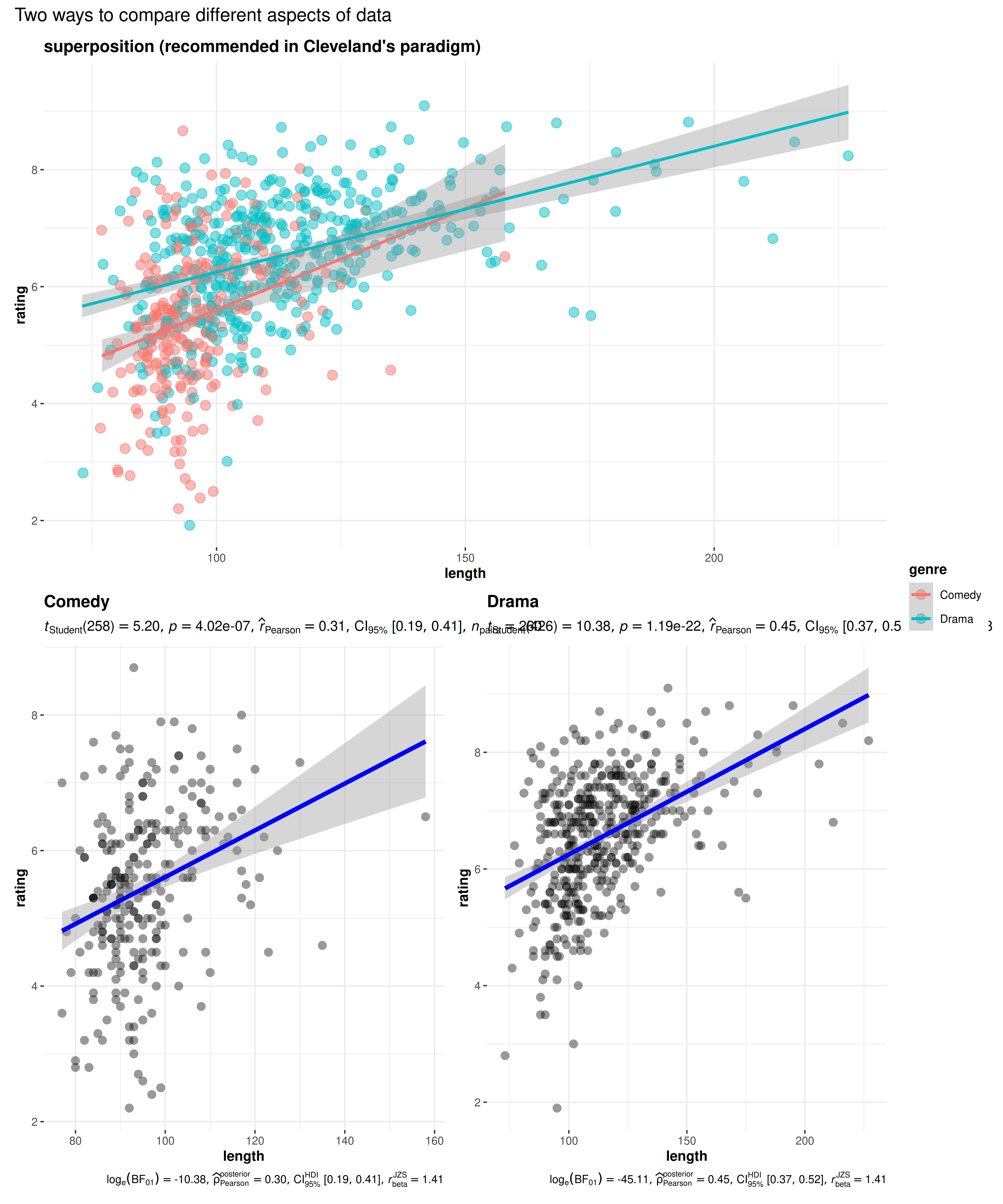
Comparing different aspects of data is much more accurate in () a plot, which is recommended in Cleveland’s paradigm, than in () a plot, which is how it is implemented in ggstatsplot package. This is because displaying detailed results from statistical tests would be difficult in a superposed plot.
The grouped_ plots follow the Shrink Principle
((Tufte, 2001), p.166-7) for
high-information graphics, which dictates that the data density and the
size of the data matrix can be maximized to exploit maximum resolution
of the available data-display technology. Given the large maximum
resolution afforded by most computer monitors today, saving
grouped_ plots with appropriate resolution ensures no loss
in legibility with reduced graphics area.
Graphical excellence
Graphical excellence consists of communicating complex ideas with clarity and in a way that the viewer understands the greatest number of ideas in a short amount of time all the while not quoting the data out of context. The package follows the principles for graphical integrity (Tufte, 2001):
The physical representation of numbers is proportional to the numerical quantities they represent. The plot show how means (in
ggbetweenstats) or percentages (ggpiestats) are proportional to the vertical distance or the area, respectively).All important events in the data have clear, detailed, and thorough labeling plot shows how
ggbetweenstatslabels means, sample size information, outliers, and pairwise comparisons; same can be appreciated forggpiestatsandgghistostatsplots. Note that data labels in the data region are designed in a way that they don’t interfere with our ability to assess the overall pattern of the data ((Cleveland, 1985);
p.44-45). This is achieved by using ggrepel package to
place labels in a way that reduces their visual prominence.
None of the plots have design variation (e.g., abrupt change in scales) over the surface of a same graphic because this can lead to a false impression about variation in data.
The number of information-carrying dimensions never exceed the number of dimensions in the data (e.g., using area to show one-dimensional data).
All plots are designed to have no chartjunk (like moiré vibrations, fake perspective, dark grid lines, etc.) ((Tufte, 2001), Chapter 5).
There are some instances where ggstatsplot graphs don’t follow principles of clean graphics, as formulated in the Tufte theory of data graphics ((Tufte, 2001), Chapter 4). The theory has four key principles:
Above all else show the data.
Maximize the data-ink ratio.
Erase non-data-ink.
Erase redundant data-ink, within reason.
In particular, default plots in ggstatsplot can sometimes violate one of the principles from 2-4. According to these principles, every bit of ink should have reason for its inclusion in the graphic and should convey some new information to the viewer. If not, such ink should be removed. One instance of this is bilateral symmetry of data measures. For example, in the figure below, we can see that both the box and violin plots are mirrored, which consumes twice the space in the graphic without adding any new information. But this redundancy is tolerated for the sake of beauty that such symmetrical shapes can bring to the graphic. Even Tufte admits that efficiency is but one consideration in the design of statistical graphics ((Tufte, 2001),
p. 137). Additionally, these principles were formulated in an era in which computer graphics had yet to revolutionize the ease with which graphics could be produced and thus some of the concerns about minimizing data-ink for easier production of graphics are not as relevant as they were.
Statistical variation
One of the important functions of a plot is to show the variation in the data, which comes in two forms:
- Measurement noise: In ggstatsplot, the actual variation in measurements is shown by plotting a combination of (jittered) raw data points with a boxplot laid on top or a histogram. None of the plots, where empirical distribution of the data is concerned, show the sample standard deviation because they are poor at conveying information about limits of the sample and presence of outliers ((Cleveland, 1985), p.220).
gghistostats(
  data = morley,
  x = Speed,
  test.value = 792,
  xlab = "Speed of light (km/sec, with 299000 subtracted)",
  title = "Distribution of measured Speed of light",
  caption = "Note: Data collected across 5 experiments (20 measurements each)"
)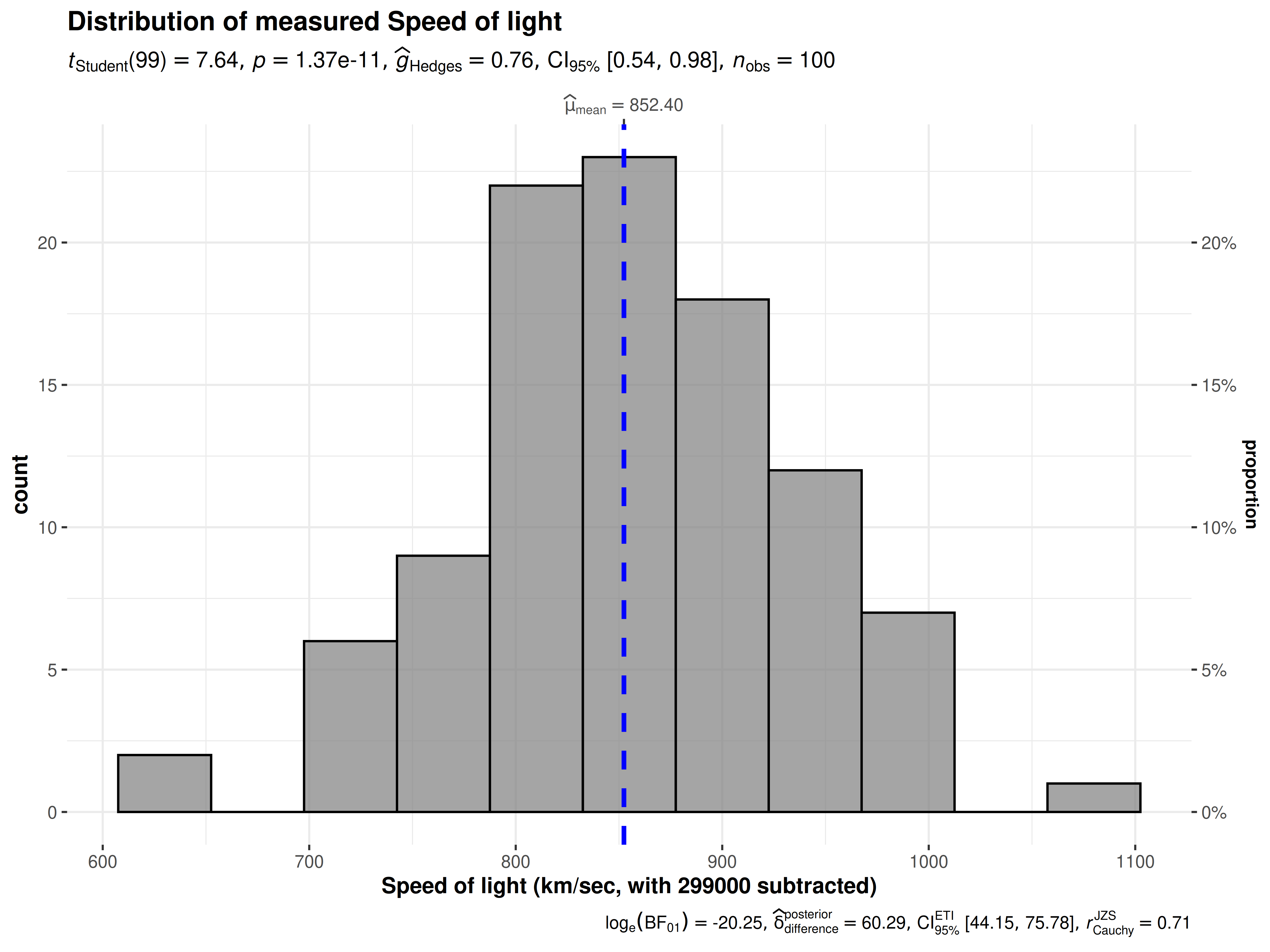
Distribution of a variable shown using gghistostats.
- Sample-to-sample statistic variation: Although, traditionally, this variation has been shown using the standard error of the mean (SEM) of the statistic, ggstatsplot plots instead use 95% confidence intervals. This is because the interval formed by error bars correspond to a 68% confidence interval, which is not a particularly interesting interval ((Cleveland, 1985), p.222-225).
model <- lme4::lmer(
  formula = total.fruits ~ nutrient + rack + (nutrient | gen),
  data = lme4::Arabidopsis
)

ggcoefstats(model)
#> Random effect variances not available. Returned R2 does not account for random effects.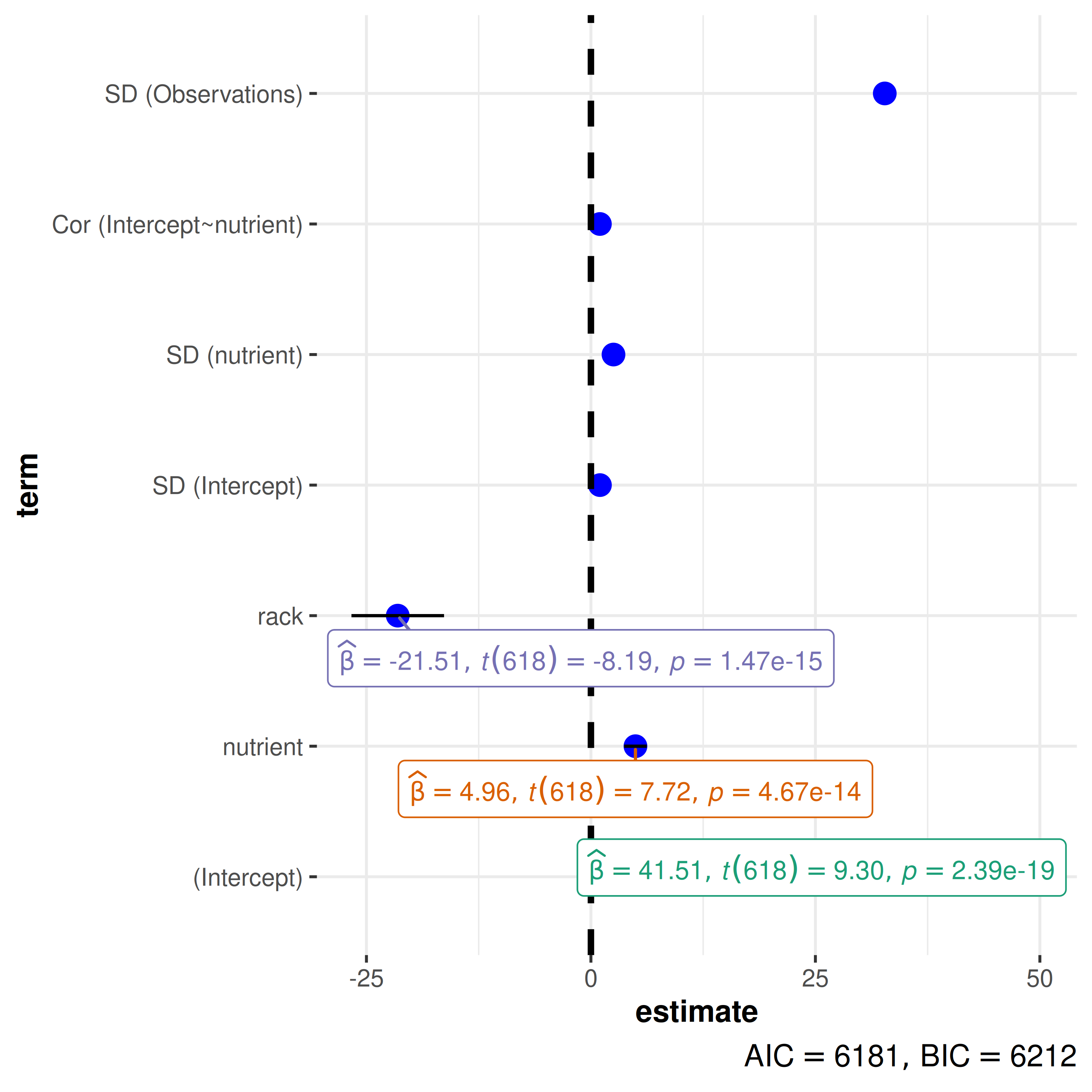
Sample-to-sample variation in regression estimates is displayed using
confidence intervals in ggcoefstats().
Statistical analysis
Data requirements
As an extension of ggplot2, ggstatsplot has the same expectations about the structure of the data. More specifically,
The data should be organized following the principles of tidy data, which specify how statistical structure of a data frame (variables and observations) should be mapped to physical structure (columns and rows). More specifically, tidy data means all variables have their own columns and each row corresponds to a unique observation ((Wickham, 2014)).
All ggstatsplot functions remove
NAs from variables of interest (similar to ggplot2; (Wickham, 2016), p.207) in the data and display total sample size (n, either observations for between-subjects or pairs for within-subjects designs) in the subtitle to inform the user/reader about the number of observations included for both the statistical analysis and the visualization. But, when sample sizes differ across tests in the same function, ggstatsplot makes an effort to inform the user of this aspect. For example,ggcorrmatfeatures several correlation test pairs and, depending on variables in a given pair, the sample sizes may vary.
## creating a new dataset without any NAs in variables of interest
msleep_no_na <-
  dplyr::filter(
    ggplot2::msleep,
    !is.na(sleep_rem), !is.na(awake), !is.na(brainwt), !is.na(bodywt)
  )

## variable names vector
var_names <- c("REM sleep", "time awake", "brain weight", "body weight")

## combining two plots using helper function in `{ggstatsplot}`
combine_plots(
  plotlist = purrr::pmap(
    .l = list(data = list(msleep_no_na, ggplot2::msleep)),
    .f = ggcorrmat,
    cor.vars = c(sleep_rem, awake:bodywt),
    cor.vars.names = var_names,
    colors = c("#B2182B", "white", "#4D4D4D"),
    title = "Correlalogram for mammals sleep dataset",
    subtitle = "sleep units: hours; weight units: kilograms"
  ),
  plotgrid.args = list(nrow = 1)
)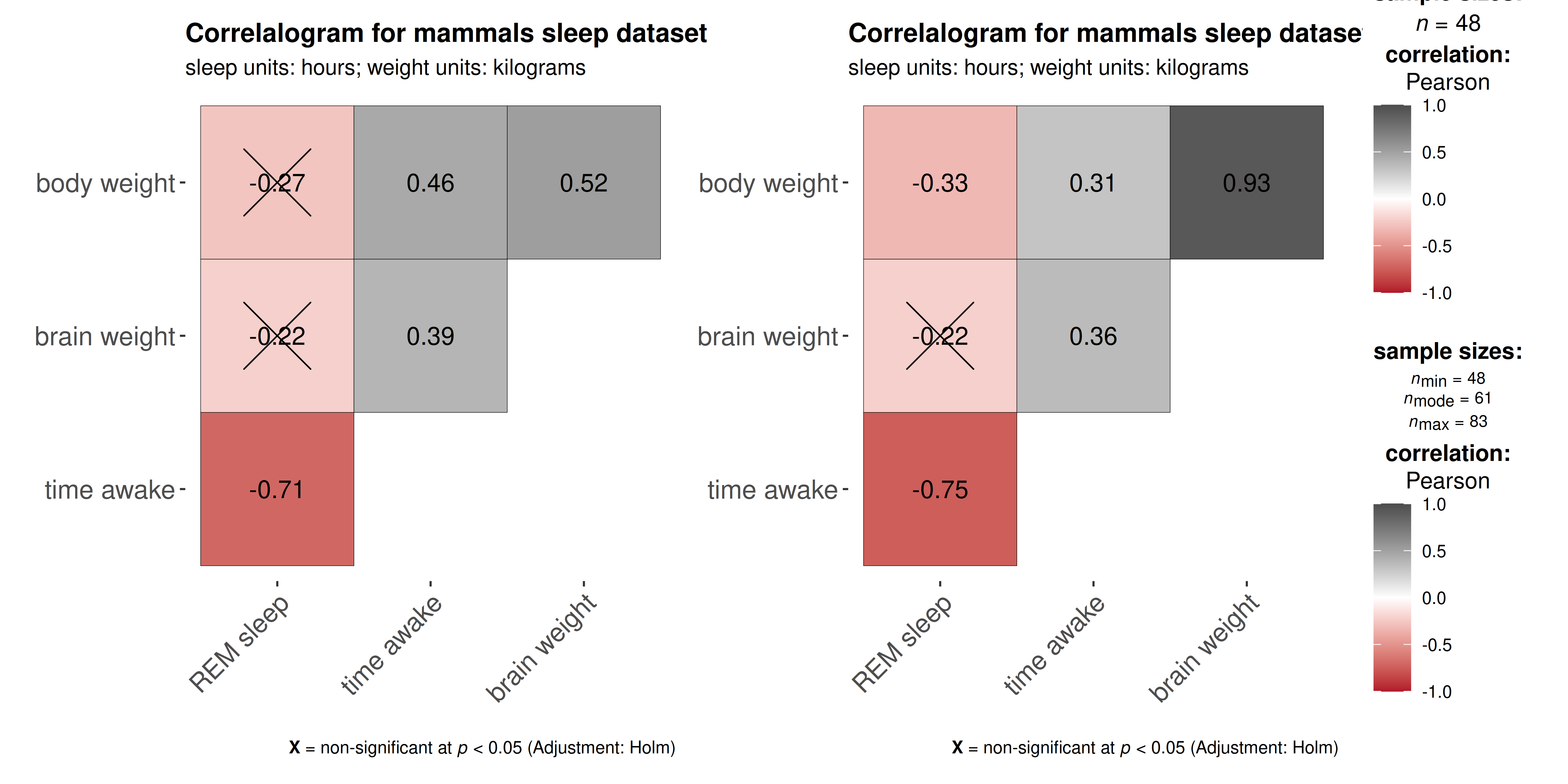
ggstatsplot functions remove NAs from
variables of interest and display total sample size , but they can give
more nuanced information about sample sizes when differs across tests.
For example, ggcorrmat will display () only one total
sample size once when no NAs present, but () will instead
show minimum, median, and maximum sample sizes across all correlation
tests when NAs are present across correlation variables.
Statistical reporting
But why would combining statistical analysis with data visualization be helpful? We list few reasons below-
- A recent survey (Nuijten, Hartgerink, van Assen, Epskamp, & Wicherts, 2016) revealed that one in eight papers in major psychology journals contained a grossly inconsistent p-value that may have affected the statistical conclusion. ggstatsplot helps avoid such reporting errors: Since the plot and the statistical analysis are yoked together, the chances of making an error in reporting the results are minimized. One need not write the results manually or copy-paste them from a different statistics software program (like SPSS, SAS, and so on).
The default setting in ggstatsplot is to produce plots
with statistical details included. Most often than not, these results
are displayed as a subtitle in the plot. Great care has
been taken into which details are included in statistical reporting and
why.
APA guidelines (Association, 2009) are followed by default while reporting statistical details:
Percentages are displayed with no decimal places.
Correlations, t-tests, and -tests are reported with the degrees of freedom in parentheses and the significance level.
ANOVAs are reported with two degrees of freedom and the significance level.
Regression results are presented with the unstandardized or standardized estimate (beta), whichever was specified by the user, along with the statistic (depending on the model, this can be a t, F, or z statistic) and the corresponding significance level.
With the exception of p-values, most statistics are rounded to two decimal places by default.
Dealing with null results:
All functions therefore by default return Bayesian in favor of the null hypothesis by default. If the null hypothesis can’t be rejected with the null hypothesis significance testing (NHST) approach, the Bayesian approach can help index evidence in favor of the null hypothesis (i.e., ). By default, natural logarithms are shown because Bayesian values can sometimes be pretty large. Having values on logarithmic scale also makes it easy to compare evidence in favor alternative () versus null () hypotheses (since ).
Suggestions
If you find any bugs or have any suggestions/remarks, please file an
issue on GitHub: https://github.com/IndrajeetPatil/ggstatsplot/issues