Visualizations with statistical details: The 'ggstatsplot' approach
Source:vignettes/ggstatsplot.Rmd
ggstatsplot.RmdThis vignette can be cited as:
To cite package 'ggstatsplot' in publications use:

  Patil, I. (2021). Visualizations with statistical details: The
  'ggstatsplot' approach. Journal of Open Source Software, 6(61), 3167,
  doi:10.21105/joss.03167

A BibTeX entry for LaTeX users is

  @Article{,
    doi = {10.21105/joss.03167},
    url = {https://doi.org/10.21105/joss.03167},
    year = {2021},
    publisher = {{The Open Journal}},
    volume = {6},
    number = {61},
    pages = {3167},
    author = {Indrajeet Patil},
    title = {{Visualizations with statistical details: The {'ggstatsplot'} approach}},
    journal = {{Journal of Open Source Software}},
  }
Summary
Graphical displays can reveal problems in a statistical model that might not be apparent from purely numerical summaries. Such visualizations can also be helpful for the reader to evaluate the validity of a model if it is reported in a scholarly publication or report. But, given the onerous costs involved, researchers often avoid preparing information-rich graphics and exploring several statistical approaches or tests available. The ggstatsplot package in the R programming language (R Core Team, 2021) provides a one-line syntax to enrich ggplot2-based visualizations with the results from statistical analysis embedded in the visualization itself. In doing so, the package helps researchers adopt a rigorous, reliable, and robust data exploratory and reporting workflow.
Statement of Need
In a typical data analysis workflow, data visualization and statistical modeling are two different phases: visualization informs modeling, and in turn, modeling can suggest a different visualization method, and so on and so forth (Wickham & Grolemund, 2016). The central idea of ggstatsplot is simple: combine these two phases into one in the form of an informative graphic with statistical details.
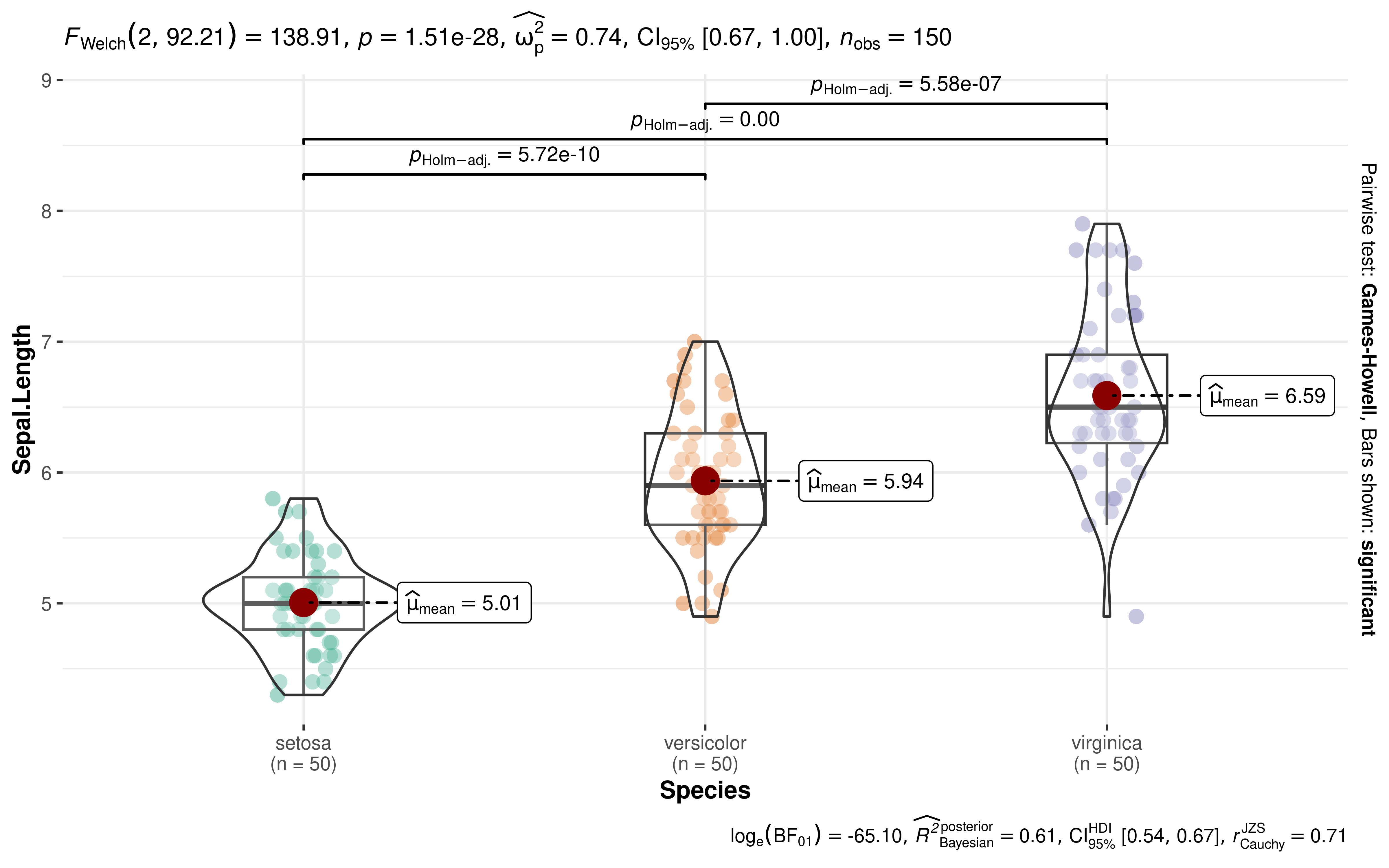
Before discussing benefits of this approach, we will show an example (Figure 1).
ggbetweenstats(iris, Species, Sepal.Length)
Example plot from the ggstatsplot package illustrating its philosophy of juxtaposing informative visualizations with details from statistical analysis. To see all supported plots and statistical analyses, see the package website:
As can be seen, with a single line of code, the function produces details about descriptive statistics, inferential statistics, effect size estimate and its uncertainty, pairwise comparisons, Bayesian hypothesis testing, Bayesian posterior estimate and its uncertainty. Moreover, these details are juxtaposed with informative and well-labeled visualizations. The defaults are designed to follow best practices in both data visualization (Cleveland, 1985; Grant, 2018; Healy, 2018; Tufte, 2001; Wilke, 2019) and (frequentist/Bayesian) statistical reporting (American Psychological Association, 2019; van Doorn et al., 2020). Without ggstatsplot, getting these statistical details and customizing a plot would require significant amount of time and effort. In other words, this package removes the trade-off often faced by researchers between ease and thoroughness of data exploration and further cements good data exploration habits.
Internally, data cleaning is carried out using the
tidyverse (Wickham et al., 2019), while
statistical analysis is carried out via the
statsExpressions (Patil, 2021) and easystats
(Ben-Shachar et
al., 2020; Lüdecke et al., 2019,
2020, 2021; Makowski et al., 2019, 2020) packages. All visualizations
are constructed using the grammar of graphics framework (Wilkinson,
2012), as implemented in the ggplot2 package
(Wickham,
2016).
Benefits
In summary, the benefits of ggstatsplot’s approach are the following. It:
produces charts displaying both raw data, and numerical plus graphical summary indices,
avoids errors in and increases reproducibility of statistical reporting,
highlights the importance of the effect by providing effect size measures by default,
provides an easy way to evaluate absence of an effect using Bayes factors,
encourages researchers and readers to evaluate statistical assumptions of a model in the context of the underlying data (Figure 2),
is easy and simple enough that someone with little to no coding experience can use it without making an error and may even encourage beginners to programmatically analyze data, instead of using GUI software.

Comparing the ‘Standard’ approach of reporting statistical analysis in a publication/report with the ‘ggstatsplot’ approach of reporting the same analysis next to an informative graphic. Note that the results described in the ‘Standard’ approach are about the ‘Dinosaur’ dataset plotted on the right. Without the accompanying visualization, it is hard to evaluate the validity of the results. The ideal reporting practice will be a hybrid of these two approaches where the plot contains both the visual and numerical summaries about a statistical model, while the narrative provides interpretative context for the reported statistics.
Future Scope
This package is an ambitious, ongoing, and long-term project. It currently supports common statistical tests (parametric, non-parametric, robust, or Bayesian t-test, one-way ANOVA, contingency table analysis, correlation analysis, meta-analysis, regression analyses, etc.) and corresponding visualizations (box/violin plot, scatter plot, dot-and-whisker plot, pie chart, bar chart, etc.). It will continue expanding to support an increasing collection of statistical analyses and visualizations.
Licensing and Availability
ggstatsplot is licensed under the GNU General Public License (v3.0), with all source code stored at GitHub. In the spirit of honest and open science, requests and suggestions for fixes, feature updates, as well as general questions and concerns are encouraged via direct interaction with contributors and developers by filing an issue.
Acknowledgements
I would like to acknowledge the support of Mina Cikara, Fiery
Cushman, and Iyad Rahwan during the development of this project.
ggstatsplot relies heavily on the easystats
ecosystem, a collaborative project created to facilitate the usage of
R for statistical analyses. Thus, I would like to thank the
members of
easystats as well as the users. I would additionally like
to thank the contributors to ggstatsplot for reporting
bugs, providing helpful feedback, or helping with enhancements.