You can cite this package/vignette as:
To cite package 'ggstatsplot' in publications use:

  Patil, I. (2021). Visualizations with statistical details: The
  'ggstatsplot' approach. Journal of Open Source Software, 6(61), 3167,
  doi:10.21105/joss.03167

A BibTeX entry for LaTeX users is

  @Article{,
    doi = {10.21105/joss.03167},
    url = {https://doi.org/10.21105/joss.03167},
    year = {2021},
    publisher = {{The Open Journal}},
    volume = {6},
    number = {61},
    pages = {3167},
    author = {Indrajeet Patil},
    title = {{Visualizations with statistical details: The {'ggstatsplot'} approach}},
    journal = {{Journal of Open Source Software}},
  }
Lifecycle: ![]()
Introduction to ggbarstats
The function ggbarstats can be used for quick
data exploration and/or to prepare
publication-ready pie charts to summarize the
statistical relationship(s) among one or more categorical variables. We
will see examples of how to use this function in this vignette.
To begin with, here are some instances where you would want to use
ggbarstats-
to check if the proportion of observations matches our hypothesized proportion, this is typically known as a “Goodness of Fit” test
to see if the frequency distribution of two categorical variables are independent of each other using the contingency table analysis
to check if the proportion of observations at each level of a categorical variable is equal
Note: The following demo uses the pipe operator
(%>%), if you are not familiar with this operator, here
is a good explanation: http://r4ds.had.co.nz/pipes.html.
ggbarstats works only with data
organized in data frames or tibbles. It will not work with other data
structures like base-R tables or matrices. It can operate on data frames
that are organized with one row per observation or data frames that have
one column containing counts. This vignette provides examples of both
(see examples below).
To help demonstrate how ggbarstats can be used with
categorical (also known as nominal) data, a modified version of the
original Titanic dataset (from the datasets
library) has been provided in the ggstatsplot package
with the name Titanic_full. The Titanic Passenger Survival
Dataset provides information “on the fate of passengers on the fatal
maiden voyage of the ocean liner Titanic, including economic
status (class), sex, age, and survival.”
Let’s have a look at the structure of both.
library(dplyr)

# looking at the original data in tabular format
dplyr::glimpse(Titanic)
#>  'table' num [1:4, 1:2, 1:2, 1:2] 0 0 35 0 0 0 17 0 118 154 ...
#>  - attr(*, "dimnames")=List of 4
#>   ..$ Class   : chr [1:4] "1st" "2nd" "3rd" "Crew"
#>   ..$ Sex     : chr [1:2] "Male" "Female"
#>   ..$ Age     : chr [1:2] "Child" "Adult"
#>   ..$ Survived: chr [1:2] "No" "Yes"

# looking at the dataset as a tibble or data frame
dplyr::glimpse(Titanic_full)
#> Rows: 2,201
#> Columns: 5
#> $ id       <dbl> 1, 2, 3, 4, 5, 6, 7, 8, 9, 10, 11, 12, 13, 14, 15, 16, 17, 18…
#> $ Class    <fct> 3rd, 3rd, 3rd, 3rd, 3rd, 3rd, 3rd, 3rd, 3rd, 3rd, 3rd, 3rd, 3…
#> $ Sex      <fct> Male, Male, Male, Male, Male, Male, Male, Male, Male, Male, M…
#> $ Age      <fct> Child, Child, Child, Child, Child, Child, Child, Child, Child…
#> $ Survived <fct> No, No, No, No, No, No, No, No, No, No, No, No, No, No, No, N…
Independence (or association) with ggbarstats
Let’s next investigate whether the passenger’s sex was independent of, or associated with, their survival status, i.e., we want to test whether the proportion of people who survived was different between the sexes.
ggbarstats(
  data = Titanic_full,
  x = Survived,
  y = Sex
)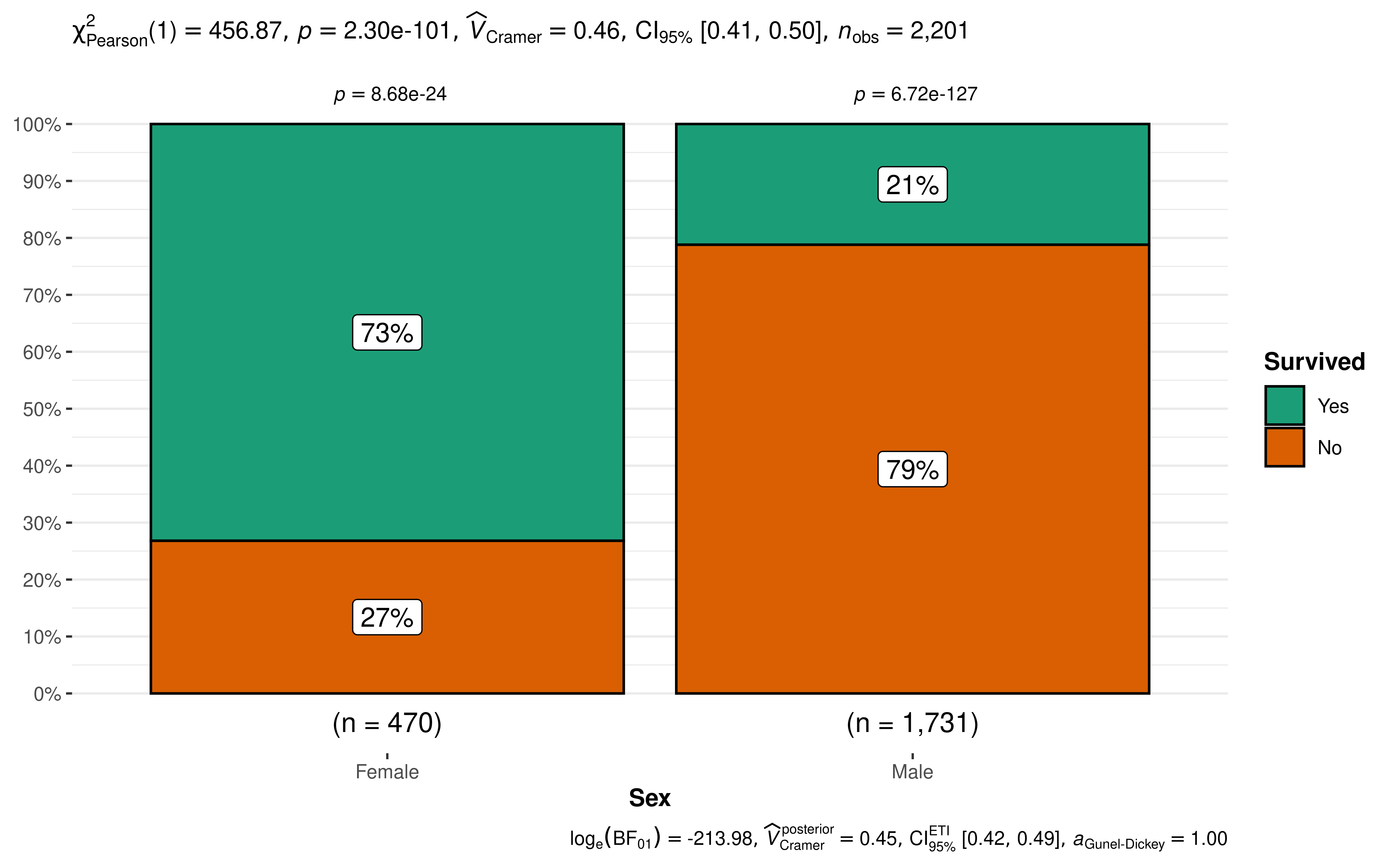
The plot clearly shows that survival rates were very different between males and females. The Pearson’s -test of independence is significant given our large sample size. Additionally, for both females and males, the survival rates were significantly different than 50% as indicated by a goodness of fit test for each gender.
Grouped analysis with grouped_ggbarstats
What if we want to do the same analysis of gender but also factor in the passenger’s age (Age)? We have information that classifies the passengers as Child or Adult, perhaps that makes a difference to their survival rate?
ggstatsplot provides a special helper function for
such instances: grouped_ggbarstats. It is a convenient
wrapper function around combine_plots. It applies
ggbarstats across all levels of a
specified grouping variable and then combines the list
of individual plots into a single plot. Note that the grouping variable
can be anything: conditions in a given study, groups in a study sample,
different studies, etc.
grouped_ggbarstats(
  # arguments relevant for `ggbarstats()`
  data = Titanic_full,
  x = Survived,
  y = Sex,
  grouping.var = Age,
  digits.perc = 1,
  package = "ggsci",
  palette = "category10_d3",
  # arguments relevant for `combine_plots()`
  title.text = "Passenger survival on the Titanic by gender and age",
  caption.text = "Asterisks denote results from proportion tests; \n***: p < 0.001, ns: non-significant",
  plotgrid.args = list(nrow = 2L)
)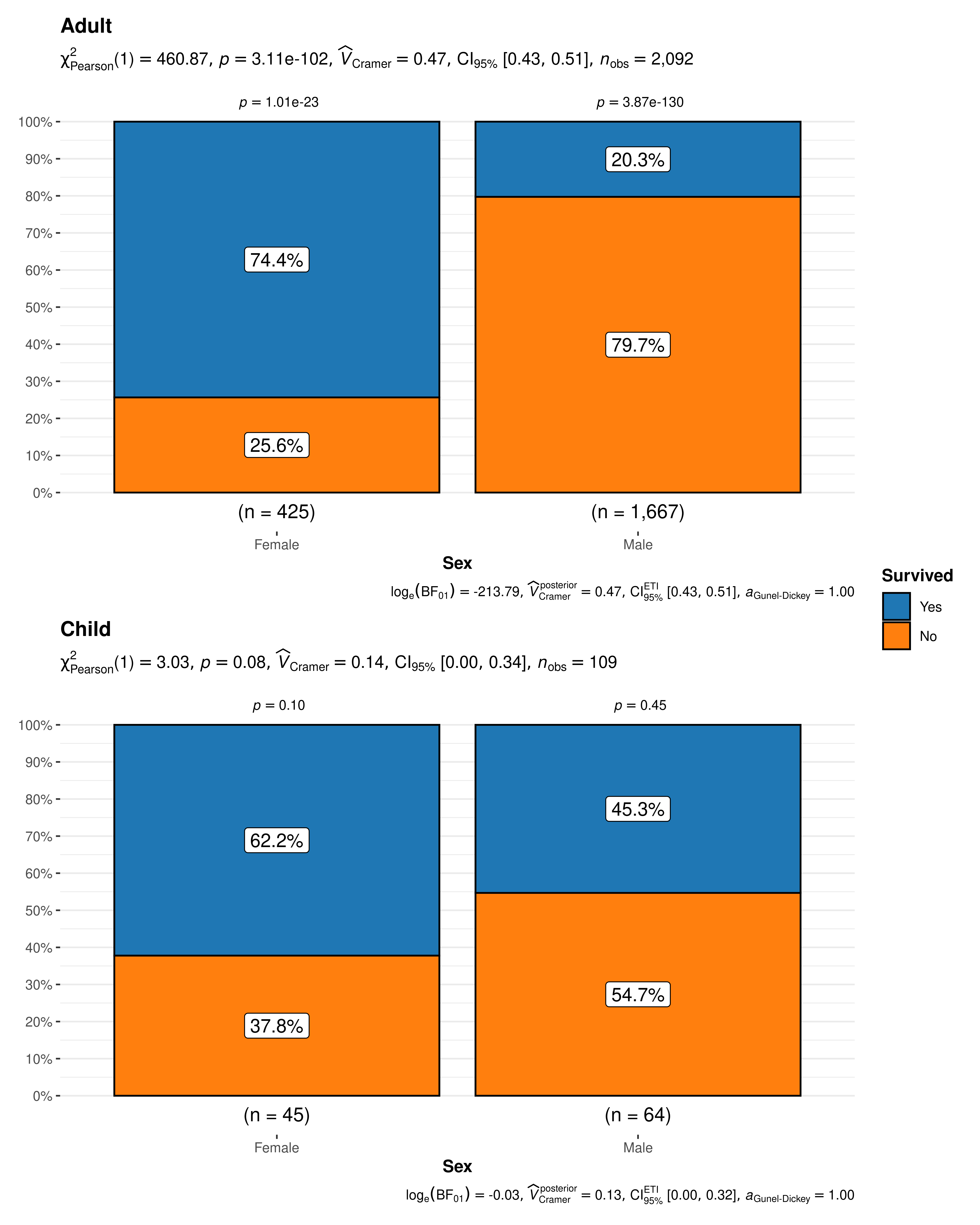
The resulting pie charts and statistics make the story clear. For adults gender very much matters. Women survived at much higher rates than men. For children gender is not significantly associated with survival and both male and female children have a survival rate that is not significantly different from 50/50.
Grouped analysis with ggbarstats +
{purrr}
Although grouped_ggbarstats provides a quick way to
explore the data, it leaves much to be desired. For example, we may want
to add different captions, titles, themes, or palettes for each level of
the grouping variable, etc. For cases like these, it would be better to
use purrr package.
See the associated vignette here: https://indrajeetpatil.github.io/ggstatsplot/articles/web_only/purrr_examples.html
Working with data organized by counts
ggbarstats can also work with data frame containing
counts (aka tabled data), i.e., when each row doesn’t correspond to a
unique observation. For example, consider the following notional
fishing data frame containing data from two boats
(A and B) about the number of different types
fish they caught in the months of February and
March. In this data frame, each row corresponds to a unique
combination of Boat and Month.
# (this is completely fictional; I don't know first thing about fishing!)

fishing <- tibble::as_tibble(data.frame(
  Boat = c(rep("B", 4), rep("A", 4), rep("A", 4), rep("B", 4)),
  Month = c(rep("February", 2), rep("March", 2), rep("February", 2), rep("March", 2)),
  Fish = c(
    "Bass",
    "Catfish",
    "Cod",
    "Haddock",
    "Cod",
    "Haddock",
    "Bass",
    "Catfish",
    "Bass",
    "Catfish",
    "Cod",
    "Haddock",
    "Cod",
    "Haddock",
    "Bass",
    "Catfish"
  ),
  SumOfCaught = c(25, 20, 35, 40, 40, 25, 30, 42, 40, 30, 33, 26, 100, 30, 20, 20)
))

fishing
#> # A tibble: 16 × 4
#>    Boat  Month    Fish    SumOfCaught
#>    <chr> <chr>    <chr>         <dbl>
#>  1 B     February Bass             25
#>  2 B     February Catfish          20
#>  3 B     March    Cod              35
#>  4 B     March    Haddock          40
#>  5 A     February Cod              40
#>  6 A     February Haddock          25
#>  7 A     March    Bass             30
#>  8 A     March    Catfish          42
#>  9 A     February Bass             40
#> 10 A     February Catfish          30
#> 11 A     March    Cod              33
#> 12 A     March    Haddock          26
#> 13 B     February Cod             100
#> 14 B     February Haddock          30
#> 15 B     March    Bass             20
#> 16 B     March    Catfish          20
When the data is organized this way, we make a slightly different
call to the ggbarstats() function: we use the
counts argument.
If we want to investigate the relationship of type of fish by month (a test of independence), our command would be:
ggbarstats(
  data = fishing,
  x = Fish,
  y = Month,
  counts = SumOfCaught,
  label = "both",
  package = "ggsci",
  palette = "default_jama",
  title = "Type fish caught by month",
  caption = "Source: completely made up",
  legend.title = "Type fish caught: "
)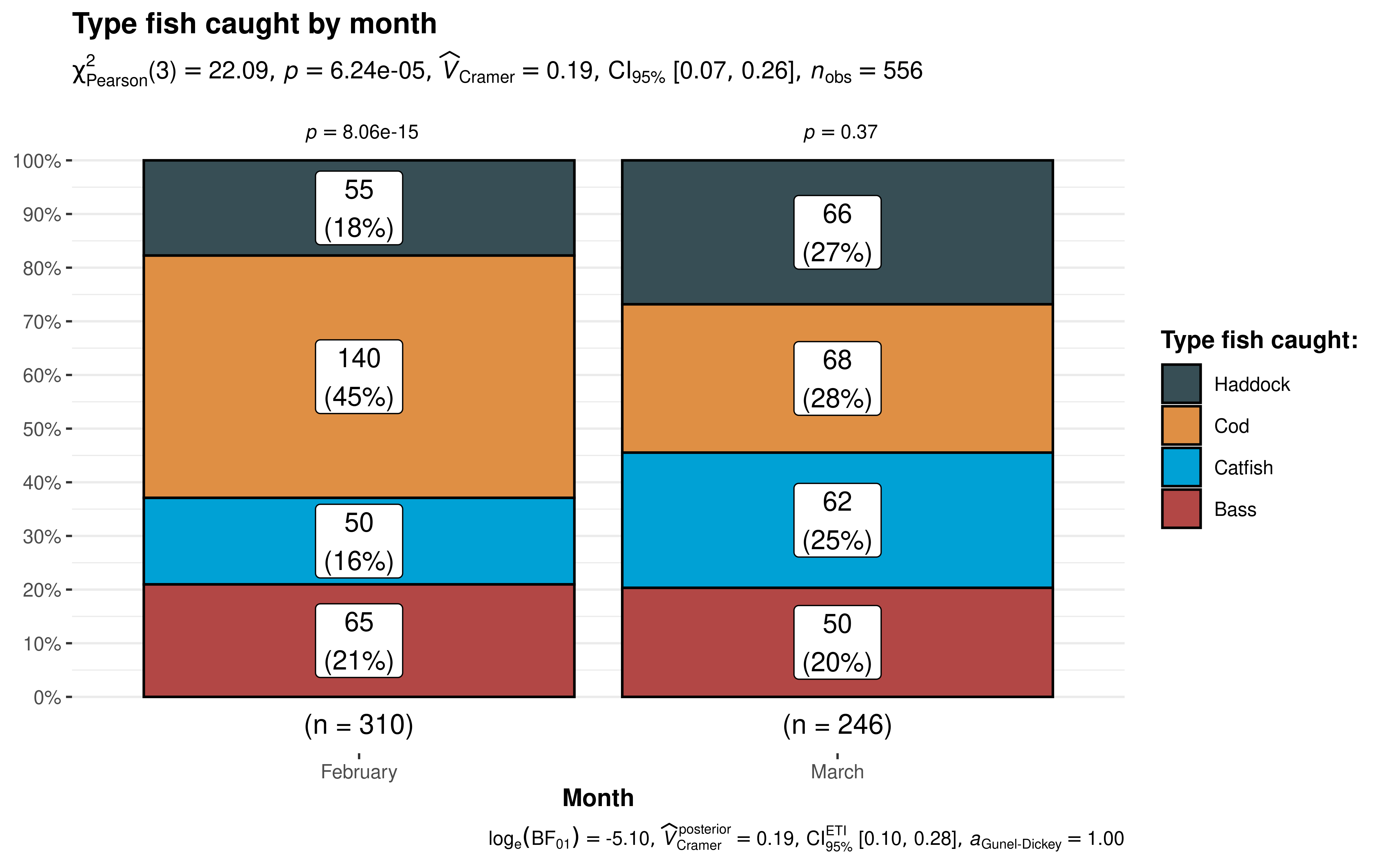
The results support our hypothesis that the type of fish caught is related to the month in which we’re fishing. The independence test results at the top of the plot. In February we catch significantly more Haddock than we would hypothesize for an equal distribution. Whereas in March our results indicate there’s no strong evidence that the distribution isn’t equal.
Within-subjects designs
Let’s imagine we’re conducting clinical trials for some new imaginary
wonder drug. We have 134 subjects entering the trial. Some of them enter
healthy (n = 96), some of them enter the trial already being
sick (n = 38). All of them receive our treatment or
intervention. Then we check back in a month to see if they are healthy
or sick. A classic pre/post experimental design. We’re interested in
seeing the change in both groupings. In the case of within-subjects
designs, you can set paired = TRUE, which will display
results from McNemar test in the subtitle.
(Note: If you forget to set
paired = TRUE, the results will be inaccurate.)
# create imaginary data
clinical_trial <- tibble::tribble(
  ~SickBefore, ~SickAfter, ~Counts,
  "No", "Yes", 4,
  "Yes", "No", 25,
  "Yes", "Yes", 13,
  "No", "No", 92
)

ggbarstats(
  data = clinical_trial,
  x = SickAfter,
  y = SickBefore,
  counts = Counts,
  paired = TRUE,
  label = "both",
  title = "Results from imaginary clinical trial",
  package = "ggsci",
  palette = "default_ucscgb"
)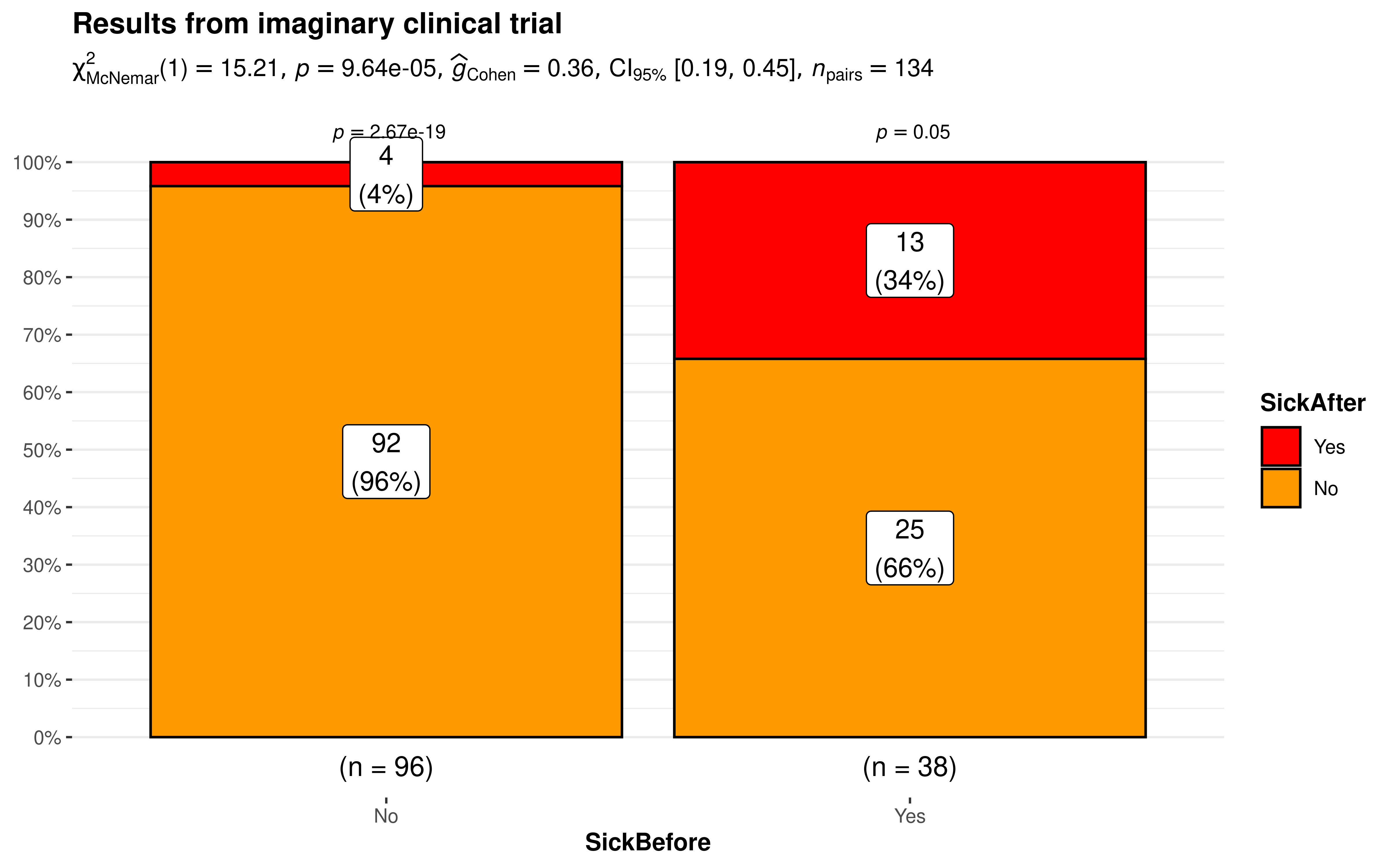
The results bode well for our experimental wonder drug. Of the 96 who started out healthy only 4% were sick after a month. Ideally, we would have hoped for zero but reality is seldom perfect. On the other side of the 38 who started out sick that number has reduced to just 13 or 34% which is a marked improvement.
Summary of graphics and tests
Details about underlying functions used to create graphics and statistical tests carried out can be found in the function documentation: https://indrajeetpatil.github.io/ggstatsplot/reference/ggbarstats.html
Reporting
If you wish to include statistical analysis results in a publication/report, the ideal reporting practice will be a hybrid of two approaches:
the ggstatsplot approach, where the plot contains both the visual and numerical summaries about a statistical model, and
the standard narrative approach, which provides interpretive context for the reported statistics.
For example, let’s see the following example:
ggbarstats(mtcars, am, cyl)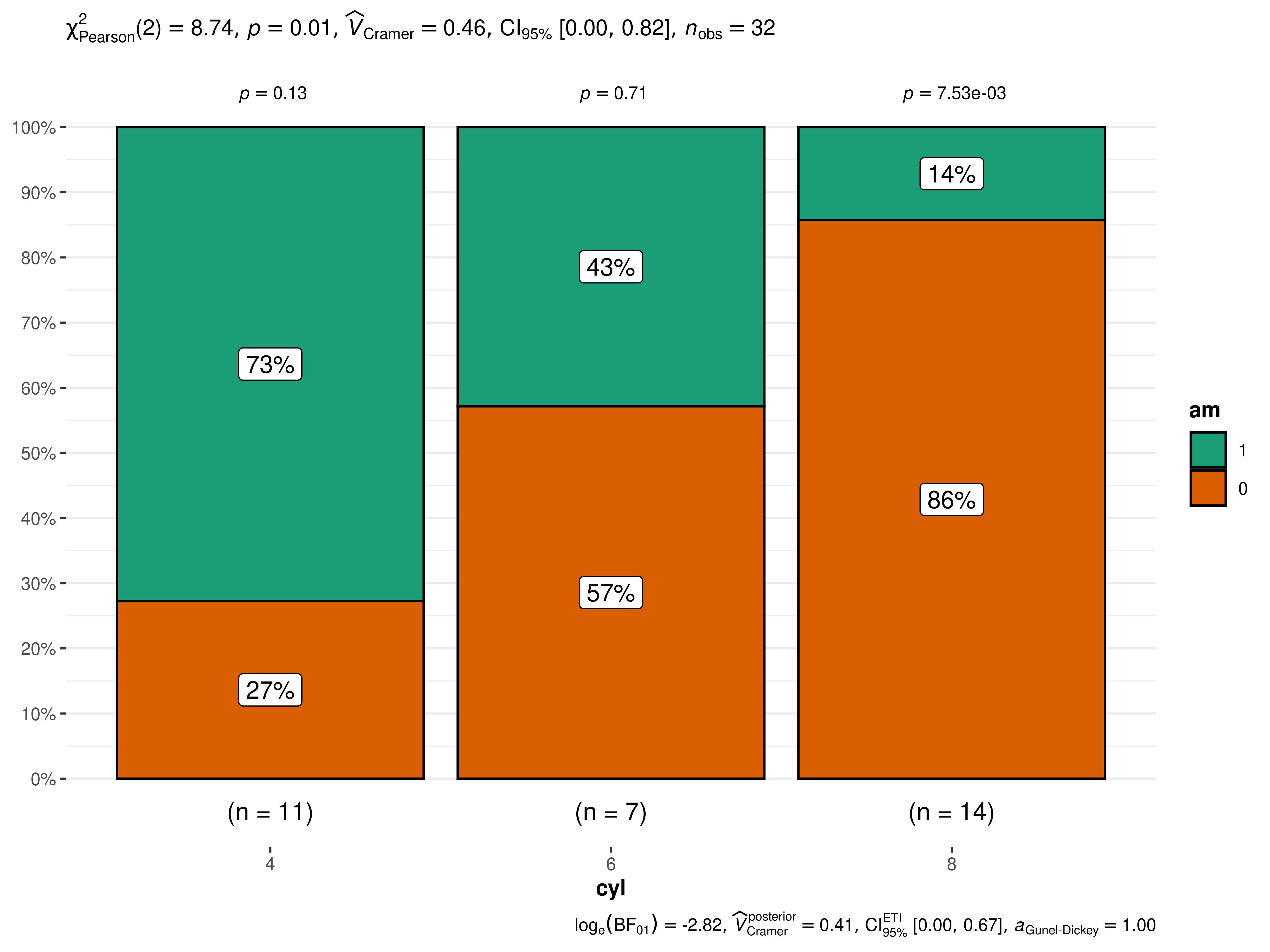
The narrative context (assuming type = "parametric") can
complement this plot either as a figure caption or in the main text-
Pearson’s -test of independence revealed that, across 32 automobiles, showed that there was a significant association between transmission engine and number of cylinders. The Bayes Factor for the same analysis revealed that the data were 16.78 times more probable under the alternative hypothesis as compared to the null hypothesis. This can be considered strong evidence (Jeffreys, 1961) in favor of the alternative hypothesis.
Suggestions
If you find any bugs or have any suggestions/remarks, please file an issue on GitHub: https://github.com/IndrajeetPatil/ggstatsplot/issues